-
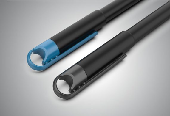
Classmate Hook
Product
-
Havells Glamtube Collection
Product

-
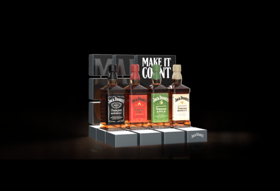
Jack Daniel Display Plinth
Spatial
-
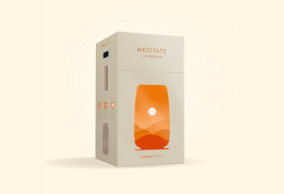
Havells Studio Meditate
Packaging
-
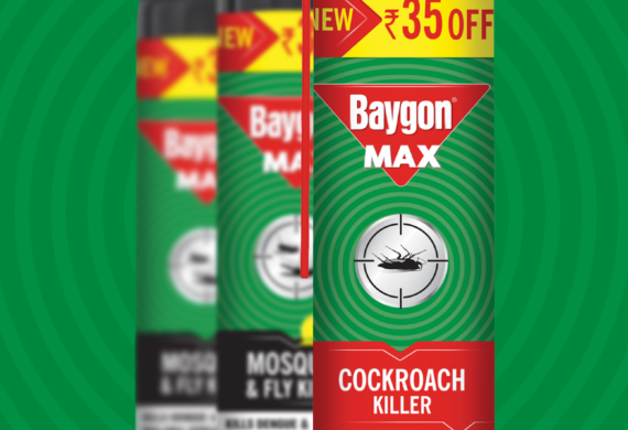
Baygon – Packaging Refresh
Packaging
-
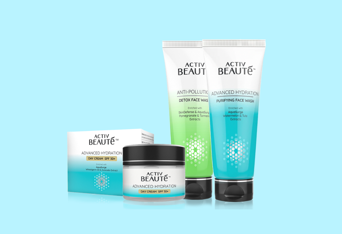
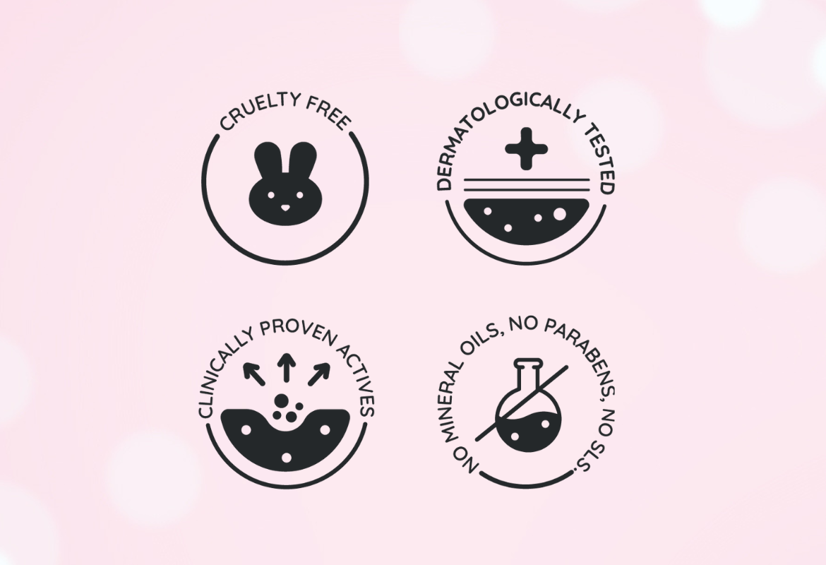
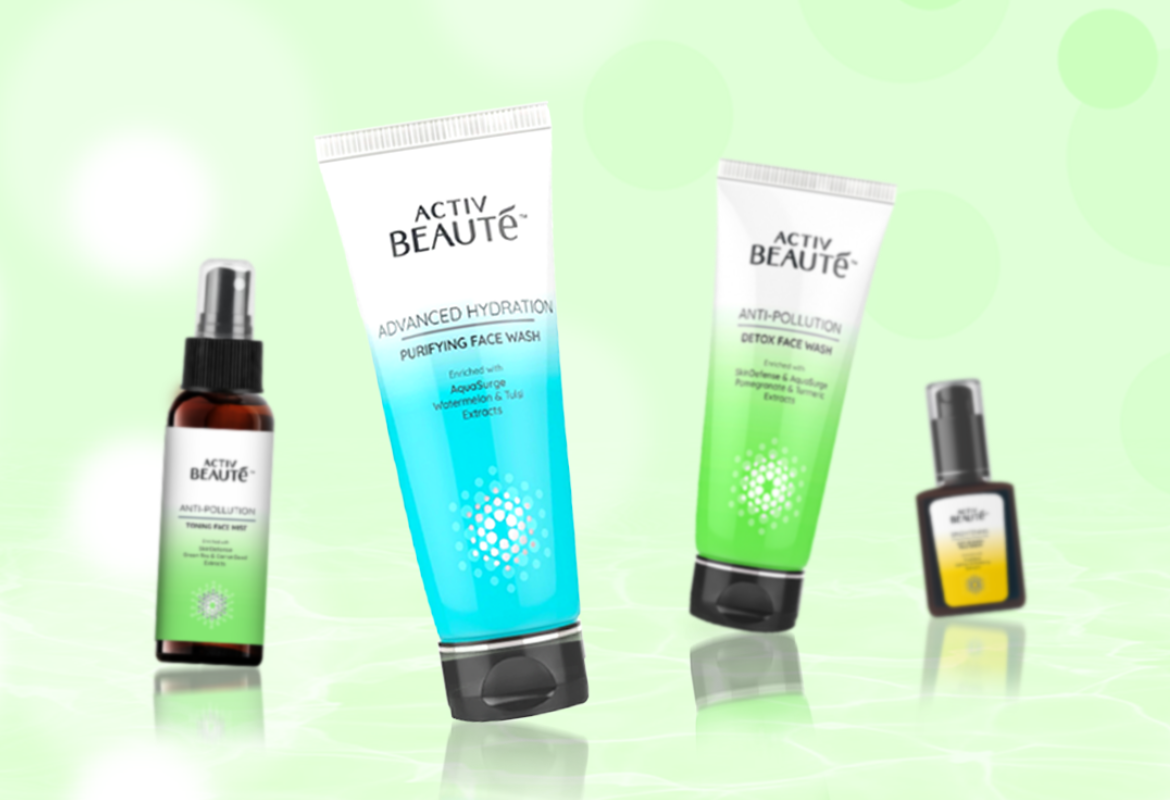
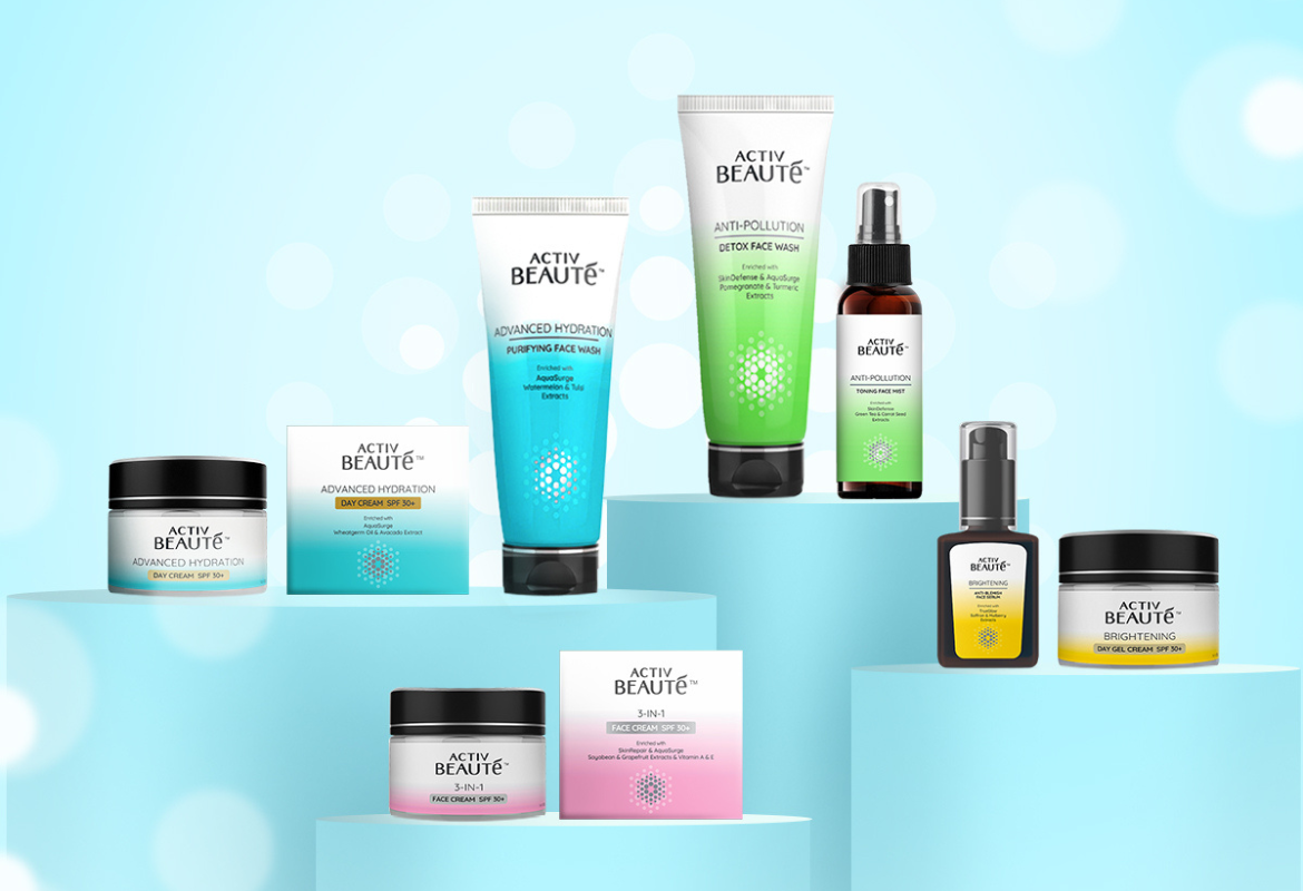
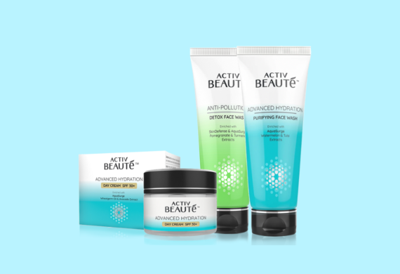
Activ Beauté
Packaging
-
Hampa – Celebrating Nature’s Miracle
Packaging

-
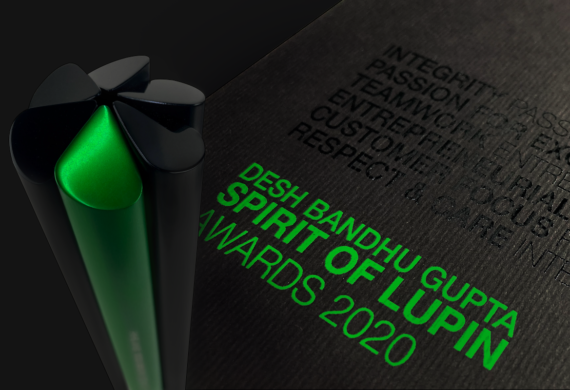
Spirit of Lupin Trophy
Trophies
-
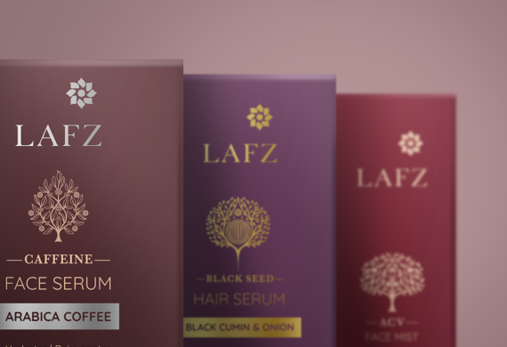
Lafz Personal Care Collection
Packaging
-
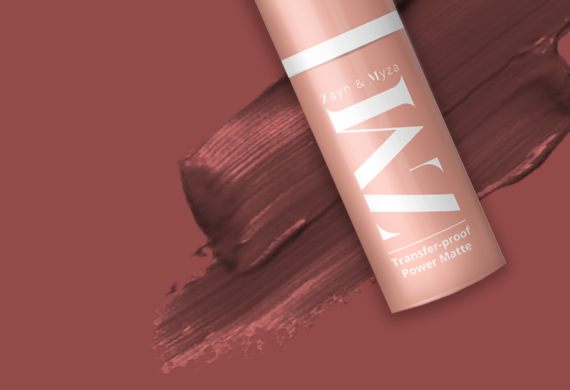
ZM Cosmetic Collection
Packaging